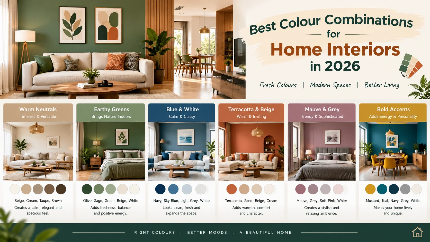
Choosing the right color combinations for home interiors is one of the most important steps in creating a beautiful, comfortable, and functional living space. Colors influence the overall appearance of a home, affect how spacious a room feels, and help establish the mood of each space. The right shades can make a small apartment look brighter, a living room feel more welcoming, and a bedroom feel calm and relaxing. In 2026, home interior color trends focus on natural shades, warm neutrals, earthy tones, muted greens, soft blues, and carefully selected statement colors. Homeowners are increasingly combining timeless colors with modern finishes, wooden textures, decorative lighting, and personalized design elements. Whether you are designing a new apartment, renovating an existing home, or planning interiors for a builder-floor apartment, selecting a balanced color palette can improve the appearance of your property without requiring expensive changes.
1. Top Home Interior Color Trends in 2026
1.1 Warm White and Beige
Warm white and beige are versatile choices for homeowners who prefer a clean, elegant, and timeless interior. Unlike stark white, warm white creates a softer appearance, while beige adds depth and warmth.
Best combinations:
- Warm white walls with beige sofas.
- Cream walls with light oak furniture.
- Beige walls with white ceilings and wooden flooring.
- Ivory walls with gold-finish decorative accents.
Best suited for living rooms, bedrooms, dining areas, and compact apartments. This combination works particularly well in homes where natural light is limited because lighter shades help reflect available light and create a more open feeling.
1.2 Sage Green and Cream
Sage green is a muted green shade that brings a natural, peaceful appearance to interiors. When paired with cream, it creates a balanced combination that feels fresh without appearing too bright.
Best combinations:
- Sage green accent wall with cream walls.
- Cream kitchen cabinets with sage green lower cabinets.
- Sage green bedroom wall with ivory bedding.
- Light green walls with natural wooden furniture.
Best suited for bedrooms, kitchens, reading corners, and nature-inspired interiors. Sage green is a good option for homeowners who want to introduce color without making the room feel visually crowded.
1.3 Terracotta and Warm Beige
Terracotta is an earthy shade inspired by clay, brick, and natural soil. It adds character and warmth to modern interiors.
Best combinations:
- Terracotta feature wall with beige surrounding walls.
- Sand-colored walls with terracotta cushions.
- Warm white walls with terracotta decorative accessories.
- Beige furniture with rust-colored curtains.
Best suited for: Living rooms, dining spaces, accent walls, and decorative corners. For a balanced look, use terracotta as an accent rather than covering every wall in a small room.
1.4 Muted Blue and Soft Grey
Muted blue paired with soft grey creates a contemporary and sophisticated appearance. It is suitable for homeowners who prefer cooler colors instead of traditional cream and beige interiors.
Best combinations:
- Dusty blue walls with light grey furniture.
- Pale blue walls with white wardrobes.
- Blue-grey accent wall with warm white walls.
- Muted blue upholstery with light wood finishes.
Best suited for: Bedrooms, study rooms, home offices, and modern living rooms. To prevent the room from feeling cold, introduce warm lighting, wooden furniture, or beige accessories.
1.5 Olive Green and Wooden Brown
Olive green and wooden brown create a grounded, natural look that works well with contemporary and traditional Indian interiors.
Best combinations:
- Olive green feature wall with walnut furniture.
- Cream walls with olive green sofas.
- Olive green kitchen cabinets with wooden shelves.
- Soft beige walls with dark brown furniture.
Best suited for spacious living rooms, master bedrooms, dining areas, and premium interiors. This palette works especially well when combined with natural textures, indoor plants, and warm lighting.
1.6 Greige and Charcoal Grey
Greige is a blend of grey and beige. It offers the neutrality of grey with some of the warmth of beige, making it a flexible choice for modern homes.
Best combinations:
- Greige walls with charcoal grey furniture.
- Light grey walls with dark grey wardrobes.
- Beige-grey walls with black metal accents.
- Greige interiors with oak or walnut furniture.
Best suited for: Contemporary apartments, home offices, living rooms, and minimalist interiors. Use darker charcoal shades selectively in compact spaces to avoid making the room feel smaller.
1.7 Blush Pink and Ivory
Blush pink and ivory create a soft, elegant interior that feels warm without being overly colorful.
Best combinations:
- Blush pink bedroom wall with ivory wardrobes.
- Ivory walls with dusty pink cushions.
- Pale pink upholstery with cream curtains.
- Soft pink accent wall with light wooden furniture.
Best suited for bedrooms, dressing areas, children's rooms, and elegant apartment interiors. For a more mature look, choose dusty rose or muted pink rather than highly saturated pink.
1.8 Mustard Yellow and Warm White
Mustard yellow adds energy and visual interest to neutral interiors. Warm white helps balance its intensity and keeps the room from appearing too bright.
Best combinations:
- Warm white walls with mustard cushions.
- Cream dining area with mustard dining chairs.
- Pale beige walls with mustard decorative accessories.
- White and wood interiors with a mustard accent chair.
Best suited for living rooms, dining spaces, creative corners, and selected accent walls. Mustard works best in controlled amounts, particularly in smaller apartments.
2. Best Color Combinations for Each Room
2.1 Living Room Colour Combinations
The living room is often the main gathering space in a home. Its colors should complement the furniture, lighting, flooring, and overall interior style.
Recommended combinations include:
- Cream and beige: A timeless choice for a bright and welcoming living room.
- Sage green and ivory: Suitable for nature-inspired interiors.
- Greige and walnut brown: Ideal for contemporary and premium designs.
- Warm white and terracotta: Creates an inviting space with a distinctive accent.
- Muted blue and light grey: Works well for modern, understated interiors.
Interior design tip: If the living room is compact, consider lighter colors for most walls and reserve a deeper shade for one focal wall, the television unit, or selected decorative elements.
2.2 Bedroom Color Combinations
Bedroom colors should support relaxation and create a comfortable atmosphere. Soft, muted shades are generally easier to live with than highly saturated colors.
Recommended combinations include:
- Sage green and cream: Calm and nature-inspired.
- Dusty blue and warm white: Soft and contemporary.
- Lavender and ivory: Gentle and elegant.
- Beige and walnut brown: Warm and timeless.
- Blush pink and off-white: Soft and sophisticated.
- Olive green and sand: Earthy and restful.
Interior design tip: Use a slightly deeper shade behind the bed to create a focal point. Keep wardrobes, ceilings, and other large surfaces in complementary lighter shades when you want a spacious appearance.
2.3 Kitchen Color Combinations
Kitchen colors should complement the countertop, cabinet finish, backsplash, flooring, and available light. Practicality also matters because cooking areas are exposed to grease, moisture, and frequent cleaning.
Recommended combinations include:
- White and light wood: A bright, natural appearance.
- Sage green and cream: Soft and modern.
- Navy blue and white: A bold, classic contrast.
- Beige and walnut brown: Warm and sophisticated.
- Light grey and white: Minimalist and contemporary.
- Olive green and ivory: A distinctive earthy palette.
Interior design tip: Use lighter upper cabinets to maintain a bright appearance. If you choose dark lower cabinets, pair them with a lighter countertop and suitable task lighting.
2.4 Dining Room Color Combinations
The dining area should feel welcoming and coordinate with the kitchen and living room, especially in open-plan apartments.
Recommended combinations include:
- Warm white and wooden brown.
- Beige and terracotta.
- Olive green and cream.
- Dusty blue and ivory.
- Greige and dark brown.
Interior design tip: If the dining area shares a space with the living room, maintain a consistent base color throughout both spaces. Use dining chairs, pendant lights, wall art, or an accent wall to create a visual distinction.
2.5 Bathroom Color Combinations
Bathrooms benefit from colors that work with tiles, sanitary fittings, mirrors, and artificial lighting.
Recommended combinations include:
- White and light grey: Clean and contemporary.
- Beige and cream: Warm and understated.
- Sage green and white: Fresh and natural.
- Charcoal and white: A modern high-contrast look.
- Sand and stone grey: A subtle, natural appearance.
Interior design tip: In a small bathroom, lighter wall tiles and a large mirror can help create a more open feeling. Use darker shades in limited areas if the bathroom has adequate lighting.
2.6 Children's Room Colour Combinations
Children's rooms should balance playful colors with flexibility as the child grows.
Recommended combinations include:
- Sky blue and white.
- Mint green and cream.
- Soft yellow and light grey.
- Lavender and ivory.
- Peach and pale beige.
Interior design tip: Keep the main walls relatively neutral and introduce stronger colors through bedding, wall decals, storage units, artwork, and accessories. This makes future updates easier and more affordable.
2.7 Home Office Colour Combinations
A home office should feel comfortable, organized, and suitable for sustained work.
Recommended combinations include:
- Muted blue and white.
- Sage green and beige.
- Greige and walnut brown.
- Soft grey and pale blue.
- Cream and olive green.
Interior design tip: Avoid strong glare from glossy finishes and consider how daylight falls on the desk and computer screen. The most suitable wall colour will depend on the room's natural light and your personal preference.
3. Best Colour Combinations for Small Apartments
Small apartments require thoughtful colour selection because the walls, furniture, storage units and flooring occupy a relatively limited visual area.
Recommended combinations
1. Warm white and light beige
This combination reflects available light and works well with compact living rooms, bedrooms and dining spaces.
2. Ivory and light wood
Ivory walls with light wooden furniture create a simple, natural appearance without adding too much visual weight.
3. Pale grey and white
This is suitable for minimalist interiors, especially when paired with warm lighting and textured fabrics.
4. Cream and sage green
Cream can be used as the main colour, while sage green adds personality through a feature wall, cushions or selected furniture.
5. Sand beige and muted blue
A neutral base with small amounts of muted blue introduces colour while keeping the overall design balanced.
- How to make a small home look spacious
- Choose a consistent base colour for connected rooms.
- Paint the ceiling white or a light complementary shade.
- Use similar undertones across walls, curtains and large furniture.
- Avoid using too many contrasting colours in a single room.
- Consider mirrors and layered lighting to improve brightness.
- Use darker colours selectively for focal points rather than covering every wall.
- Test paint samples before deciding on a final shade.
Remember that colour alone cannot make a small apartment feel spacious. Furniture proportions, storage, lighting, ventilation and the arrangement of the room also play important roles.
4. How to Choose the Right Interior Colour Combination
Step 1: Understand the room's natural light
Observe whether the room receives direct sunlight, indirect daylight or very little natural light. A colour that looks warm in a bright room may appear dull or different in a darker space.
Step 2: Select a main colour
Choose one primary shade for the majority of the walls. Warm white, cream, beige, greige and pale grey are versatile starting points.
Step 3: Add a secondary colour
Use a complementary shade for selected walls, wardrobes, furniture or curtains. Sage green, dusty blue, terracotta and muted pink can work well as secondary colours.
Step 4: Introduce an accent colour
An accent colour creates contrast through cushions, artwork, decorative objects, dining chairs or a feature wall. It should complement the main palette rather than compete with it.
Step 5: Match the furniture and flooring
Consider the undertones of wood, marble, granite, tiles, laminates and upholstery. Warm-toned furniture often pairs naturally with cream and beige, while cooler finishes may suit soft grey and muted blue.
Step 6: Check the lighting
Warm-white lighting can make cream, beige and earthy colours appear richer. Cooler lighting can make some colours look sharper or less warm. Test the combination under the lighting you intend to use in the finished room.
Step 7: Test before painting
Apply sample patches to the wall and observe them at different times of the day. Check the shades alongside your actual flooring, curtains and furniture before finalising the palette.
5. Colour Combination Ideas Based on Interior Style
Modern minimalist interiors
Choose warm white, greige, pale grey and light wood. Keep decorative colours limited and focus on clean lines, simple furniture and uncluttered surfaces.
Luxury interiors
Consider ivory, beige, muted gold, walnut brown and selected charcoal accents. The sense of luxury comes from the balance of colours, material quality, lighting and detailing rather than from expensive-looking colours alone.
Traditional Indian interiors
Warm cream, earthy terracotta, deep green, teak brown and muted gold can complement wooden furniture, traditional artwork and decorative elements.
Contemporary interiors
Combine greige with charcoal, sage green with ivory or muted blue with light grey. These palettes work well with simple furniture, modern lighting and understated finishes.
Nature-inspired interiors
Choose sage green, olive, sand, cream and natural wood. Indoor plants, linen-style fabrics, stone finishes and woven textures can strengthen the natural theme.
6. Colour Combinations for Walls, Furniture and Curtains
A well-designed room does not require every item to match exactly. Instead, the colours should complement each other.
| Interior element | Suggested color choices |
| Main Wall | Warm white, ivory, beige or greige |
| Feature wall | Sage green, terracotta, muted blue or olive |
| Ceiling | White or a light complementary shade |
| Wooden furniture | Oak, teak, walnut or natural wood |
| Cutains | Cream, beige, soft grey or a muted accesnt |
| Sofa and upholstery | Beige, grey olive or dusty blue |
| Decorative accents | Muted gold, rust black or selected jewel tones |
These are starting points rather than fixed rules. The best combination depends on the room's proportions, the undertones of each material and the amount of natural light.
7. Common Interior Colour Mistakes to Avoid
Using too many colours
Too many unrelated shades can make a home look visually busy. Start with a small palette and repeat selected colours across connected rooms.
Ignoring natural light
Always test paint samples in the actual room. Artificial lighting and daylight can change how a colour appears.
Choosing colours before flooring and furniture
If flooring, kitchen cabinets or large wardrobes are already installed, select wall colours that complement those permanent finishes.
Using dark colours everywhere
Dark shades can look sophisticated, but covering every surface in a small or poorly lit room may make it feel enclosed. Balance darker colours with lighter finishes and adequate lighting.
Following trends without considering personal preference
A trending colour may look attractive in photographs but may not suit your lifestyle. Choose colours you will be comfortable living with over time.
Forgetting maintenance
High-contact areas may require durable, washable paint finishes. Kitchens, bathrooms and children's rooms may need products suited to their specific moisture, cleaning or wear requirements.
8. Budget-Friendly Ways to Refresh Home Interior Colours
Updating your home's colour scheme does not always require a complete renovation.
- Repaint one feature wall instead of the entire room.
- Change cushion covers, throws and curtains to introduce a new palette.
- Refinish or repaint selected cabinets if the material and finish allow it.
- Add artwork and decorative accessories in complementary colours.
- Use coordinated bedding to refresh the bedroom.
- Choose a consistent colour palette before purchasing new furniture.
- Compare paint types and finishes based on durability, coverage and maintenance, not just the price per litre.
Before starting, calculate the approximate wall area and check the manufacturer's coverage information. Primer, surface preparation, labour and the number of coats can affect the final painting cost.
Conclusion
The best colour combinations for home interiors in 2026 bring together comfort, visual balance and practical design. Warm white and beige offer timeless appeal, sage green and cream create a natural atmosphere, terracotta adds warmth, and muted blue with soft grey gives a contemporary look. For small apartments, lighter base colours and carefully selected accents can help create a brighter appearance. In larger rooms, deeper shades such as olive green, charcoal and terracotta can add character when balanced with suitable lighting and complementary materials. Before choosing a final colour scheme, consider the room's natural light, furniture, flooring, intended use and maintenance needs. Testing samples before painting is one of the simplest ways to achieve a cohesive result. A thoughtfully selected colour palette can make your home feel more welcoming, coordinated and personal without requiring unnecessary design changes.
Frequently Asked Questions
1. What are the best colour combinations for home interiors in 2026?
Popular contemporary choices include warm white and beige, sage green and cream, terracotta and beige, muted blue and grey, olive green and wood, and greige with charcoal accents. The best option depends on your room size, lighting and preferred style.
2. Which colour is best for a living room?
Warm white, cream, beige and greige are versatile living room choices. Sage green, terracotta and muted blue can be introduced as accent colours to add character.
3. Which colour combination is best for a small apartment?
Warm white with light beige, ivory with light wood, or cream with sage green are useful options. They create a light, coordinated appearance when combined with appropriate lighting and furniture.
4. Which colours are suitable for a master bedroom?
Sage green and cream, dusty blue and white, beige and walnut brown, and olive green with sand are suitable combinations for a calm bedroom atmosphere.
5. Is white a good colour for home interiors?
Yes. White and off-white shades are versatile and can help reflect light. Warm white often creates a softer appearance than stark white, particularly when paired with wooden furniture and warm lighting.
6. Which colours make a room look bigger?
Light shades such as warm white, ivory, pale beige and soft grey can help a room feel more open, particularly when the ceiling, walls and large furniture have a coordinated palette. Natural light, mirrors and furniture placement also influence the result.
7. Which colour combinations look luxurious?
Ivory with walnut brown, beige with muted gold, greige with charcoal and cream with olive green can create a sophisticated appearance. Good lighting, well-finished surfaces and coordinated furniture are equally important.
8. Which colour is best for a modular kitchen?
White and light wood, sage green and cream, beige and walnut, and navy blue with white are attractive options. Select finishes that are practical to clean and coordinate with the countertop and backsplash.
9. Should every room in a house have the same colour?
No. Each room can have its own colour combination. However, using a consistent base colour or repeating a few complementary shades across connected spaces helps create a cohesive interior.
10. How can I select the right wall colour for my furniture?
Identify whether your furniture has warm, cool or neutral undertones. Test wall-colour samples beside the furniture, flooring and curtains under both daylight and artificial lighting before making the final choice.