Choosing the right color combinations for your home interior is one of the most important design decisions. Colors influence mood, spatial perception, lighting, and the overall harmony of your home. A well-planned palette can make a small space feel larger, a dark room feel brighter, and a house feel truly like a home.
1. White & Neutral Shades (Classic and Timeless)
Color examples: White, off-white, ivory, beige, cream, greige, light taupe
Why it works
Neutral tones are timeless and adaptable. They reflect light well, making spaces appear open and airy. These colors act as a blank canvas that allows furniture, artwork, and textures to stand out.
Best areas
- Living rooms
- Bedrooms
- Hallways
- Open-plan homes
Design tips
- Use warm whites in rooms with less sunlight
- Add contrast using wood, metal, or textured fabrics
- Layer different neutral shades to avoid a flat look
2. Blue & White (Calm and Refreshing)
Color examples: Navy blue, sky blue, powder blue, teal
Why it works
Blue creates a calming, stress-reducing environment, while white balances it by adding brightness and freshness. This combination feels clean and elegant.
Best areas
- Bedrooms
- Bathrooms
- Kitchens
Design tips
- Navy blue as an accent wall adds sophistication
- Pair with brass or warm wood to avoid a cold feel
- Avoid very bright whites; choose soft or warm whites
3. Green & Earthy Browns (Natural and Balanced)
Color examples: Sage green, olive, forest green, brown, tan
Why it works
Green is associated with nature and balance. When paired with earthy browns, it creates a grounded, peaceful atmosphere that feels fresh yet warm.
Best areas
- Living rooms
- Home offices
- Reading corners
Design tips
- Combine with indoor plants for a cohesive look
- Use wooden furniture to enhance warmth
- Keep ceilings and trims lighter for balance
4. Grey & Yellow (Modern and Energetic)
Color examples: Light grey, charcoal, mustard yellow, pastel yellow
Why it works
Grey offers neutrality and sophistication, while yellow adds energy and positivity. Together, they create a modern and lively interior.
Best areas
- Living rooms
- Dining areas
- Creative spaces
Design tips
- Use yellow mainly as accents (cushions, artwork)
- Light grey works better than dark grey in small spaces
- Ensure good natural lighting
5. Black & Gold (Luxurious and Dramatic)
Color examples: Matte black, charcoal, brushed gold, champagne gold
Why it works
Black adds depth and drama, while gold introduces warmth and elegance. This combination is associated with luxury and high-end interiors.
Best areas
- Formal living rooms
- Dining rooms
- Feature walls or décor zones
Design tips
- Balance with light walls or flooring
- Use gold sparingly for a refined look
- Matte finishes feel more modern than glossy
6. Pastels & Soft Greys (Soft and Contemporary)
Color examples: Blush pink, mint green, lavender, peach, light grey
Why it works
Pastels are soothing and visually light. When paired with soft greys, they feel modern without being overwhelming.
Best areas
- Bedrooms
- Nurseries
- Guest rooms
Design tips
- Pair with white or light wood furniture
- Keep décor minimal to maintain elegance
- Ideal for smaller homes and apartments
7. Earthy Warm Tones (Cozy and Inviting)
Color examples: Terracotta, rust, clay, warm beige, burnt orange
Why it works
Warm earthy tones create a cozy and welcoming atmosphere. They add character and emotional warmth to interiors.
Best areas
- Living rooms
- Dining spaces
- Accent walls
Design tips
- Balance with white or cream ceilings
- Use warm lighting to enhance the colors
- Works well with handcrafted or textured décor
How to Choose the Right Color Combination
Room size and light
- Small rooms benefit from lighter shades
- Dark rooms need warm or reflective colors
Mood and function
- Calm spaces: blues, greens, neutrals
- Energetic spaces: yellows, corals
- Elegant spaces: black, navy, jewel tones
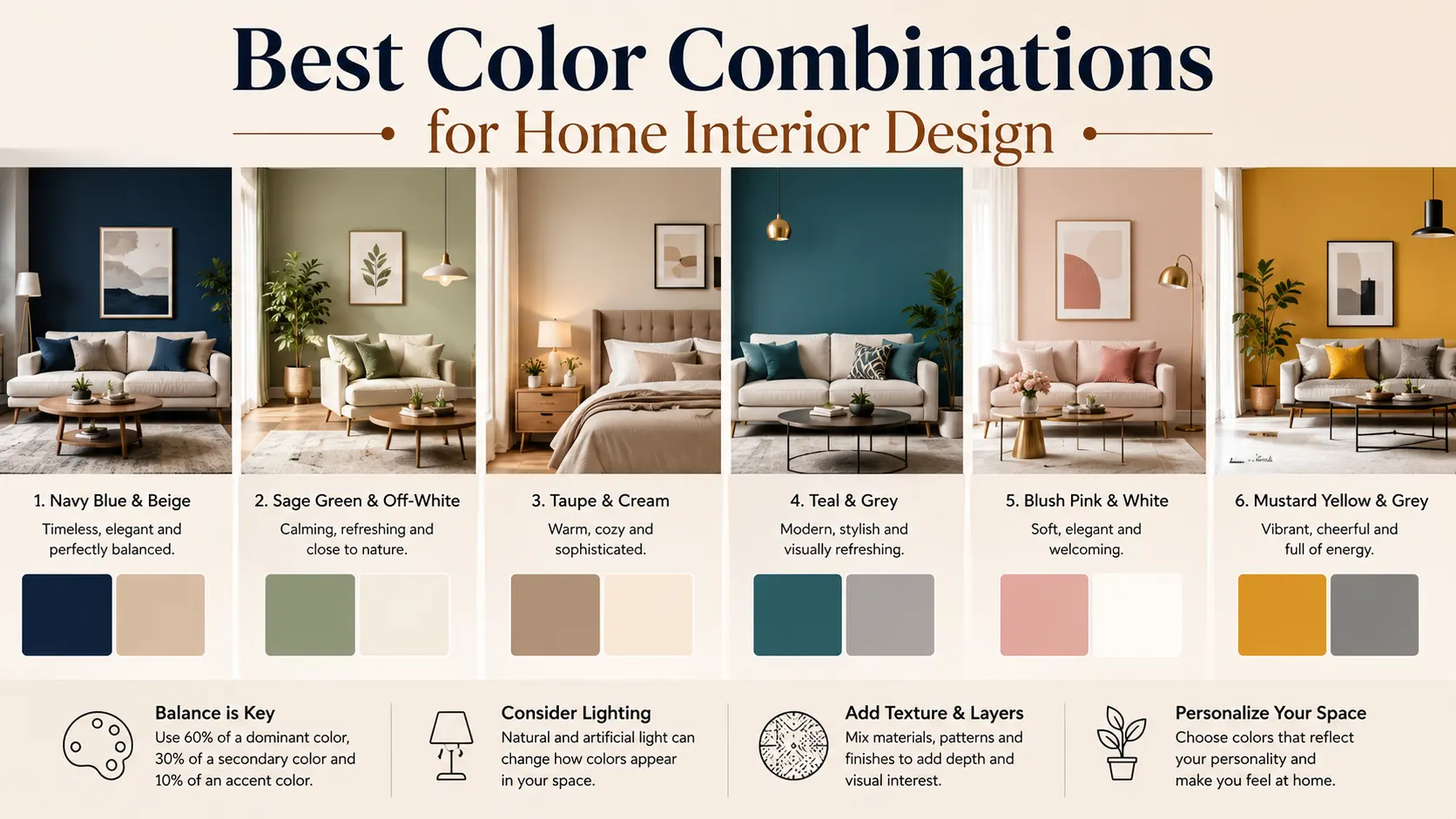
The 60–30–10 rule
- 60% dominant color (walls)
- 30% secondary color (furniture)
- 10% accent color (decor)
Conclusion
The best interior color combination is one that:
- Matches your lifestyle
- Enhances natural light
- Feels emotionally comfortable
- Creates visual harmony throughout the home